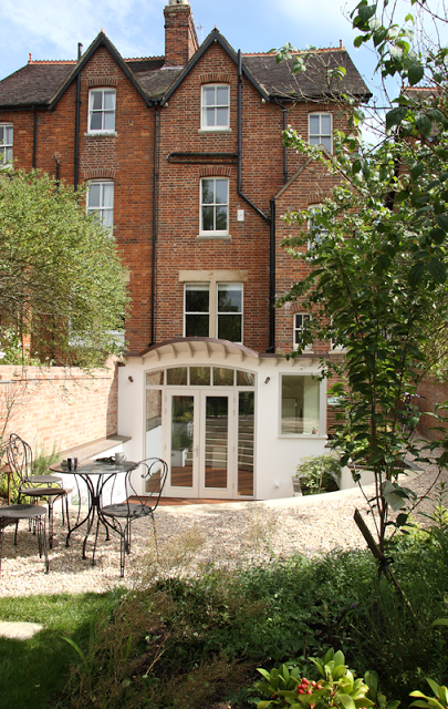
This project was stage 5 and 6 of the complete overhaul of the victorian house: the extension and the garden.

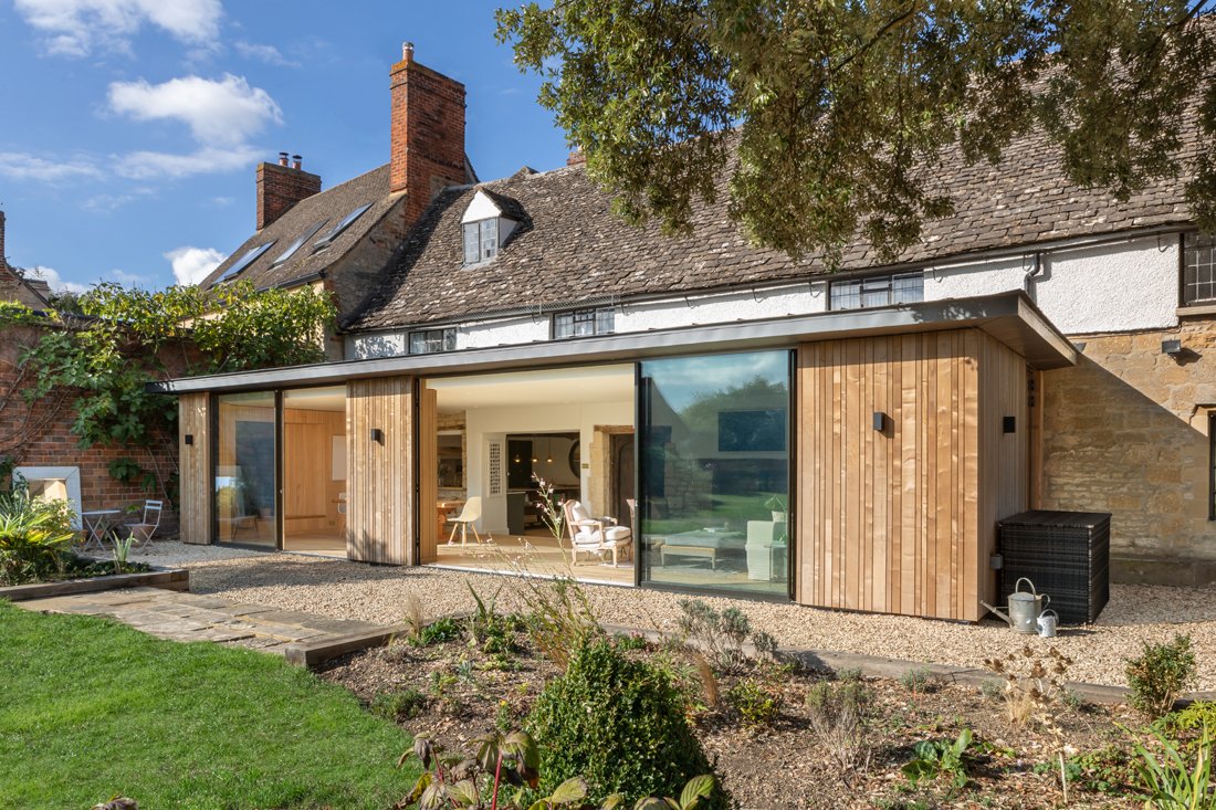
The extension was a longtime in planning. Although not a large extension it was a slightly problematic one, as a basement excavation. There were many issues to address in the design and during the build. The garden is long and relatively thin and the building is very tall (5 floors). This tends to lock out some of the light during the winter months. A leaky old conservatory was to be replaced, and the back wall of the house knocked out to lead into the new space. We recommended our clients commission Ifor Rhys RIBA architect to design a structure that would give a better aspect on to the garden, a space for dining, and incorporate an existing small utility room. Ifor is a great architect, fun to work with, and konws Oxford houses well. The idea was to open up the vista from the kitchen to allow some more light in and create a space that could work as a slightly more formal dining space. We also commissioned garden designer Rose Lennard to plan a garden that would take into consideration the new building. With Charlotte as project manager, Ifor and Rose, the design that was settled upon looked fabulous. There was an introduction of a roof that ran back towards the house, slightly curved, that allowed a view to the sky from the kitchen and a glass structure over the main area where the extension meets the old building. This light well designed to bring more light in. In tandem, a corner window assists in this endeavour. Rose created ideas around zoning the planting, creating raised beds local to the house for immediate drama, and in the garden, curves along a lawn that took in the old apple tree and reflected the curve of the steps.

gently curved copper roof with overhang

side view of corner window and cedar screen
A key part of this project was going to be the negotiations with the neighbours. One of the obstactles to overcome was the party wall ownership. Over time the wall had become destabilised by invasive ivy and the washing out of the lime mortar by the elements. This mean't the wall closest to the house was leaning some 30 degrees over the neighbours garden. It took some time in agreements to gain the necessary permissions to rebuild it whilst the extension was taking place. This prolonged the project somewhat, but didn't affect the overall vision.


The building contractors Blackford Builders, were very sensitive to the age and nature of the building and its surroundings and as such kept the wall looking authentic. They reused the bricks that were salvaged from the wall, cleaned off the mortar and reset them. In total 9 metres of wall was rebuilt. They also took great care not to disturb the planting of the neighbours garden and the look and feel of the wall from the neighbours side.
The contractors were fantastic throughout the project, really wonderful to work with, and it shows that they really enjoyed the skills used to make and finish every element so precisely; the achievement of this project was only possible through their skill, commitment, and attention to detail. Thank you Jim!
Another concern was the use of copper (looking too bright) that was to cover the roof. This dulled very quickly and had brassed down to a lovely patina within 4 months. It now fits in beautifully and is a worthy addition to the overall vision.
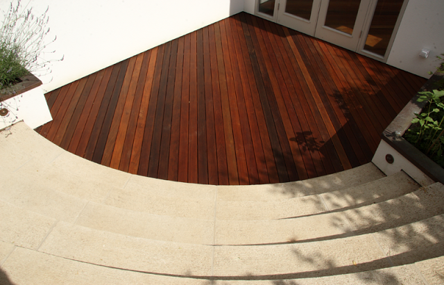
Part of the plan of the extension was to make sense of the space directly outside. This was conceived as an outdoor living space, and an extension to the dining area designed for entertaining in summer. This area is defined by the raised borders, the curved steps rising to the ground floor and the decking area. All the top edges of the borders were capped with copper to tie in with the whole theme. Copper lighting from Lighting for Gardens were used in various ways to light areas of the garden. We used inset lighting on the steps, spot lights either side of the doors and spike and mushroom lights in the borders to light the path and the trees.
The external rendering was carried out by a specialist coating company: using a very specialist product called Sto. It was a pure white finish designed to reflect the light around the area local to the extension. It has a special polymer that gives the material a stronger structure. It is also versatile in as much as it can be overpainted in future should it become necessary.
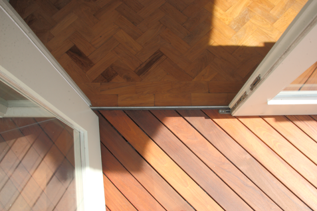
The decking is Ipe hardwood (colour akin to the copper roof) and was placed down on a 42 degree angle to the back doors. It is raised by 40-50cm with a drain away insert to avoid waterlogging. It also works seamlessly with the interior floor level.

The stairs that lead up to ground level, were cast in white portland cement and curved. Six steps take you from the Ipe deck to the ground floor. They are wide enough to sit comfortably on in summer and to make the use of in winter without the threat of slipping. A slightly brushed effect on top of the tread adds extra grip.


The garden and stage 6 carried on when the extension was completed. Using Rose Lennard's scheme with a few alterations we carried out the complete overhaul of the garden.
The garden was completely stripped out during a harsh winter. Work was carried out by myself and with additional works by a hard landscape company i.e. (re-turfing and the patio area to the rear).
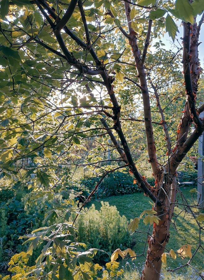
The sweep of spar stones at the top of the steps are perfect for trampling across - they don't tend to move when walking over. The borders are now swelling with new shapes, textures and colours - It still retains much of its kitchen cottage style - due to Rose's planting scheme however her design gives wonderful emphasis to the more mature trees like the Magnolia and the Apple.