a north oxford house

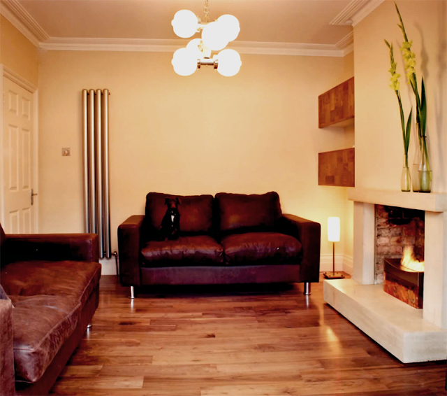
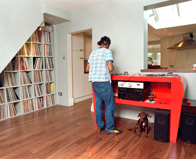
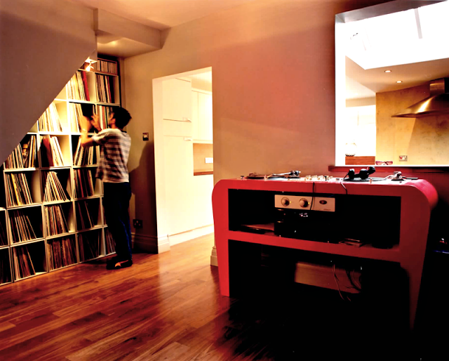
Drawing room and dining room >

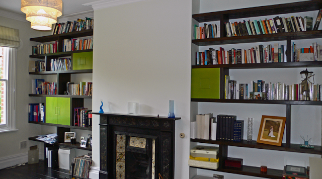
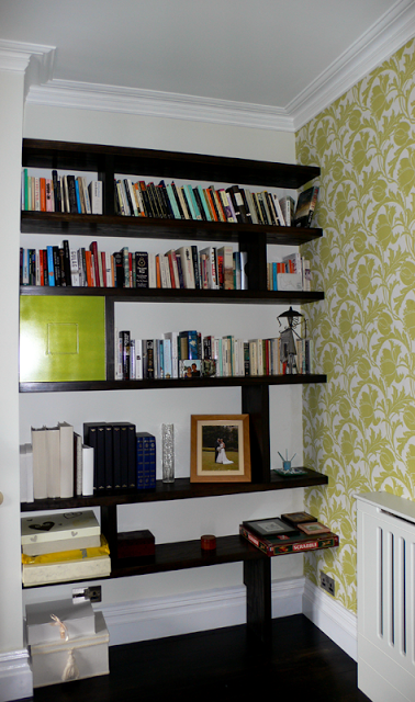
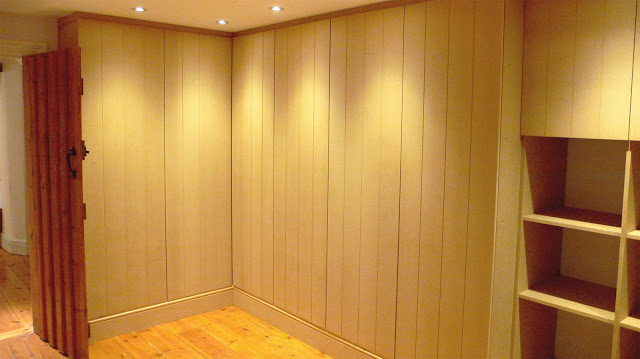
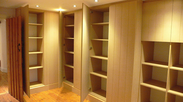
In this drawing room (a proper, first floor affair) light and the huge windows are all. We wanted to create a design that played with formal traditional drawing room style, and messed about with it, adding colour and fun. A huge element of the room is the floor to ceiling shelving structure, which is constructed from ash with an ebonised hardwood that delineates and configures the structure. This was designed to house various elements including books, objects, TV and media and a stereo with space for cd's. This was a one-off item which we created for the client. It holds your attention and commands the space that it lies in. There is an almost art deco feel to it, with the dark and light woods and polished finish.

detail of shelving

The sofas were sourced from Fran at Liscious Interiors, and re-upholstered in striking fabrics in soft brushes cotton. The colours reflected the dining space but lifted and lightened. The Chesterfield grey sofa has a purple running through it and we applied very bright violet buttons to the piece and dressed with lime accents. The lime - or chartreuse - Chesterfield was very simply dressed and as such we reversed the colour works and had predominantly purple striped cushions in a deep velvet. 

A small day bed wrapped in a defined purple inhabits a space close to the book shelves and near to the distinctive sash windows.

A  balance between privacy and letting the light through was achieved by way of full length linen curtains with a silk floral motif running through, and a sheer roman blind that drops down (colourfully) to frost out the background, again in natural linen but with colourful stripes.

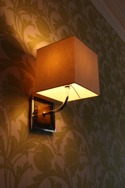
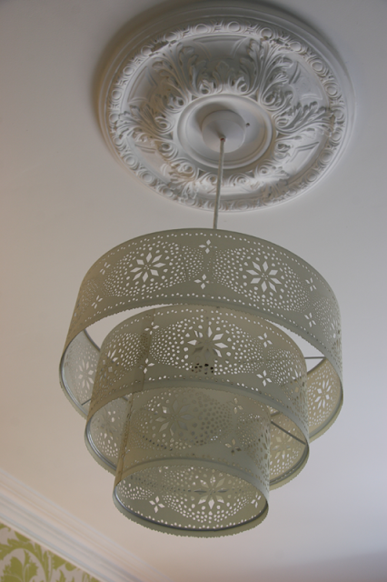
We strongly felt that this huge space did not need a central ceiling light, but to light the space with

soft accent lighting at lower level would create better intimacy and harmony in an evening. The Alega glass table lamps (designed by

Vico Magistretti

in 1970) sits on Platner side tables, each a stainless steel spoke framework with a glass top created by

Warren Platne

r for Knoll in the 1960's. 

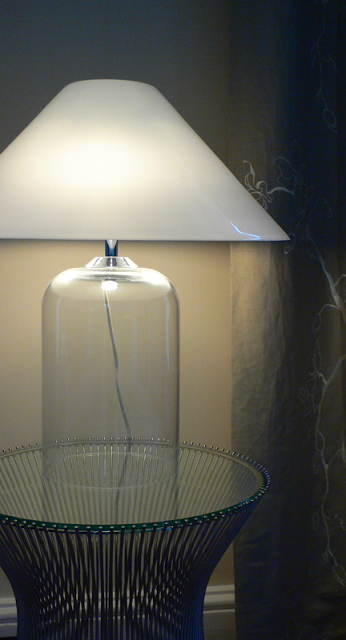
Platner side table with Alega lamp

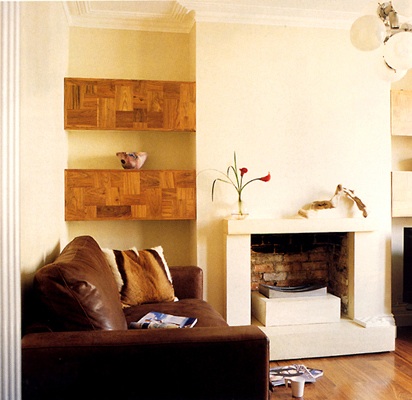
The beautiful carrera marble fireplace is a focal point, its gas fire supplementing the classicv column radiators (in anthracite) we put in, and the alcoves either side are wallpapered with a fantastic

Jocelyn Warner

design. Period chairs were limed and re-upholstered in a funky silk, and an

Elizabeth Blackadder

piece catches the eye above the fire.

Dining Space >

glass table reflecting the window

Previous to its present incarnation, this was a jumbled space, cold and dark and possibly with mixed use. In its present form we decided to change shape a little. Keeping the 'hand made element' we made something a little more formal i.e  an evening dining space for guests.

Our client wanted a dark, intimate and rich palette, but with linking colour from the drawing room next door. Assisted by our client the colour we chose was a plum colour, in a proper flat matte, not cold. It sits more in the red spectrum. This gives it a deep lushness that with the addition of evening candle light, brings in a grandiose quality.

Add caption

Of the candelabra; it is hand crafted by French makers

Benoit Vieubled

and acquired through

Cameron Peters Fine Lighting

. Its artisan qualities shine out. Made from brass and copper and french glass yoghurt jars and crystals. It was further modified by myself with deft assistance by the owner, converting it from electrical to hold candles. Furthermore, it hangs by sash cord which is fixed via a pulley system and tied off near the dumb waiter. This allows the piece to be raised and lowered when necessary. Secondary lighting is via the picture lights overhanging the inherited pieces of our client.

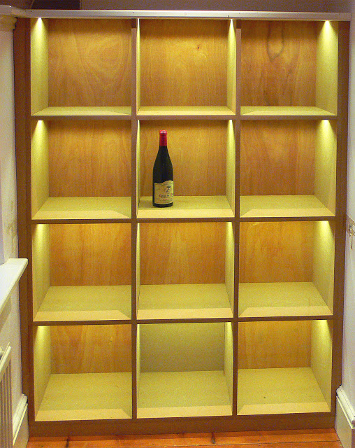
On first entering the room from the hallway it becomes obvious that the dumb waiter is no longer functioning. Due to modifications in the past it had become a non viable restoration project. This left us with the awkward shape in the corner! As the owner wished to house some of his wine collection we decided that the best purpose of the woodwork was to turn it into a wine rack. I think this works especially well and looks rather neat and perfect as well as being architectural and fun.

wine storage

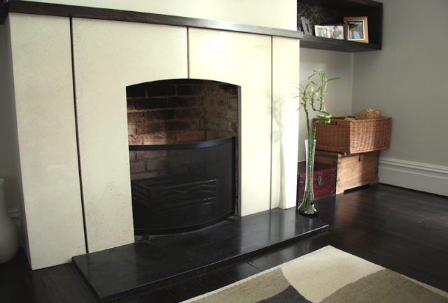
The carrera marble fireplace needed extensive cleaning to the marble to bring it up to a gleam. The hearth was simply of limed concrete and as such was painted black. A writing bureau, hand painted by Maitre Allegre now sits in the alcove closest to the window.

A collage of mirrors that we collected from a host of places hang in a pattern above the fireplace.

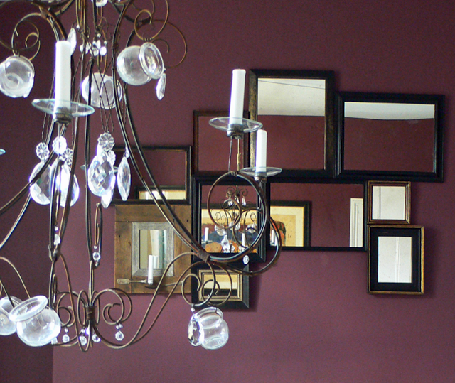
detail of candelabra with mirrors behind

Under foot, the carpet is a fine boucle in a light grey that adds a level of luxury to the rooms. It runs through the dining and lounge space and spills on through the hallway and staircase.

Below is a picture of the hallway with the dining space chimney wall framed in the antique mirror.

functionality and colour in a kitchen - grandpont house

Victorian House: 

features: Lacanche gas oven, Island unit, slate grey porcelain tiles, lime green, oak lantern, Blanco inset sink.

This project was the second of 3 commissions by our client, after working with them on the design of

loft with on-suite

, and then later their

garden

.

This began life pre-extension and the remit was to design a kitchen that was highly functional and host various items like a large and rather special

eurocave

wine fridge (see photo) and also a smaller wine unit to be housed in the island unit. The list of appliances continued; there was the

Lacanche

 range; a multi ring gas burner that was to stand centre stage in the kitchen. The owner being a very interested and extremely capable chef insisted upon this furniture, and why not! The extension was cleverly designed by architect 

Tony Reedman

, making much of a slightly awkward space. The extension was carried out to a very good standard and so made the process of designing for the space much easier than it could have been. It is imperative that your builder is accommodating at this stage as various items will impact on the final design. Whilst some features had to be altered i.e.size of steel beams holding up the house, most of the structure and size was kept within targets. Working with an experienced design team at In House, we organised a design that fitted the needs of the client and made sense of the space: ample room for cooking, room for art on walls and a place where this family could be seated in an evening or entertain.

Kitchens are notoriously difficult to organise and generally work around very clear principles. However, every space is different and can ask different questions of the designer.

While its recommended that one should have a good understanding of the principles of kitchen design, commonsense and awareness of the practicalities of usage and the dynamics there in, are essential. 

In the photo > Cabinet work is in a mixture of Anthracite and white gloss both with doors that have matching edge details.

Inset handles on the cabinetry avoid fuss and visually speak more discreetly about a design. They also fair a little better chronographically and tend never to lose that much in style.

Set within the anthracite top of the island unit is the Blanco

 'zerox' inset sink, with one large sink and a small drainer. Its a 1000mm x 510 unit and has a low profile that keeps the sharp quality to the design.

The incredibly hard wearing floor tiles are ceramic 

and the pattern that ensued clearly adds to and makes sense of the linearity of the space.

The lengths of floating shelving, 50mm thick and 350mm wide, were manufactured from the same material as the worktop, also in anthracite and so complimented the rest of the units. Their fixing method is concealed. With the projected weight it was considered that allowances should be made during the building process to accommodate it: as a result, medium density building blocks were used rather than thermalite blocks at the fixing points, in order to secure them.

On the feature wall the client commissioned a mirror which was covered rather ornately in mixed elements of fabric from

SQUINT

designs and it sits upon the green wall very effectively. Other elements of interest are got through the individual elements that our client brings to the room such the stainless steel vegetable holder which rests upon the island unit like a floating piece of sculpture.

The colour on the wall is very striking and was chosen by Charlotte. Strong accent colour like this can be quite hard to work with, but we both felt there was a great deal of spirit and good health about this colour and to use it in the scheme would be very affirming. In fact, later on you will see that the colour is repeated in the

garden design

. To see this room of an evening, have a look at the

kitchen in use

post, which shows off how joyful and colourful even such a vividly minimal and practical kitchen can be.

Striking, clean, highly functional and full of fun. 

victorian terrace: funky lounge and a dj room


walnut alcove shelving and cast concrete fireplace
Yr: 2003+/-

The lounge that was created, presented a warm front that included the brown tan leather sofas and one-off walnut alcove units that flanked the chimney breast. There was also a cvo firevault fire.
The fireplace as part of the one-off aspect that we like to throw into our projects was designed and created by rogue-designs.  It's made from concrete, parts of which were cast in-situ. It appears to float due to the shadow detail that we applied to it.

The walnut floor is a feature to the whole of the ground floor - approximately 96sqm. 

The vintage lighting again, was sourced through a supplier in London. 

The image above the fireplace was from a collage that i made and had blown up onto a foam panel. 


The space known as the DJ room, is situated between the kitchen and the lounge. The room housed the owners record collection. A functioning glitter ball was also attached to the ceiling. A discreet spotlight activated the spinning ball when switched on.  

No speaker cable was visible due in part to it all being housed behind the skirting boards. speaker points were then dotted around for increased flexibility. 

The dj console was created by rogue-designs, especially to house the dj decks with a space under for other electronic equipment. It was sprayed in a gloss lipstick red. As it was a feature to the space it warranted a stand alone quality.


bespoke dj deck


Victorian house: a study

The study: 

The theme of dark stained wood and flooring continued through to this room from the living room area. Made from Piranha Pine at 40mm thick, a funky shelving system with some lime green enclosed spaces houses an assortment of books and objects.


study


study with shelving

corner view

The huge window overlooking the garden floods in greenly, so we took this palette and applied it to the walls, by way of a heritage Zoffany wallpaper pattern, fresh and funky.

The wall lights that you see are of glass and stainless steel with a silver frame and a light canvas square shade. The light is titled 'opera' by Chad lighting.  This room was always going to be a study room for books and ephemera and so it was important not to overcomplicate the room.

a beautiful wall light
The main lighting is represented by one ceiling rose from bsweden called 'gladys' by designer Louise Hederstrm.  It features three concentric steel circles that have a laser cut floral motif. Very simple and yet very elegant. We thought it would be particularly apt given the lamp shade in the main lounge area was also a series of laser cut concentric circles.

the gladys lampshade from b sweden

Aside from this, we gave the room a desk, constructed from the same material as the shelving and let the owners take it from there!


a grown up living room - victorian house

Victorian House living room  

features: cast concrete fire surround with wood detailing, stained piranha pine box shelving, dark stained flooring, double sliding curtain rail, danish rosewood sideboard, architectural light shade, handmade radiator covers.

We chose to use an organic and muted colour range complimented by the use of dark stained material (including the floor), textures and subtle tonal changes to create an intimate room with a quiet aspect. We promptly got to work on a fireplace design, and hand cast a simple white polished concrete piece with stained wood mantle.  A large L shaped grey corner sofa provides flexible seating. The vintage Danish rosewood sideboard from our lovely friends at The Modern Warehouse sits on the back wall against striking wallpaper.

Opposite, on either side of the chimney breast, there is a configuration of dark stained display boxes of differing sizes. They are like a sliding rule - each pair amounts to the same space, separated by the chimney breast. We used the wallpaper at the backs to set off the objects within, and create continuity with the feature wall. The large oak table with two slate insets is the owners own.

Above the fireplace is a very striking mirror which the owner purchased from a gallery in the Czeck republic. Its strong features also informed the design and it adds a great focal point to the room.

The cut perspex pendant lamp is designed by Louise Campbell for Louis Poulsen, titled 'collage', has 3 concentric white perspex rings which have been laser cut with a floral motif. When the light is on, it creates a wonderful flecked floral pattern around the room, especially when the light is subdued. As there are many strong design elements in the room, the light shade doesn't actually dominate, it rather delicately absorbs with colours.  In fact it tends to sit in the background until lit when it takes on its splendour.

The ceiling rose that you see, is a beautifully crafted plaster reproduction of a heritage piece that was installed as part of the design.We felt the ceiling looked rather sparse without it. While it wasn't evident that a ceiling rose had been there previously, the room has fine original cornice molding, so it sits perfectly well, and creates focus and mixes the old and new with the contemporary chandelier.

Two pairs of curtains, one sheer linen for privacy, the other a thick raw weave cotton for warmth, are full length and hang on a double bay window pole  in brushed steel (a piece of clever engineering) It is finished off with hand blown glass finials. Small touches against large bold pieces help to create little surprises that enhance the experience.

Below are a few detail shots from the room.

shelving and storage

This is a small selection of the shelving that was completed recently in an ancient barn. Originally the first unit below had a fixed back, but then it was decided that we could use glass as a partition and create the mirror of the shelves on the reverse. This was quite tricky but in the end the result was an excellent room divider, double depth shelving, light coming through from both sides during the day, and illuminable at night.
the second set of photos show built in storage for a wine cellar/ utility room. 


First stage completed.

The unit is completed when painted white and becomes reflective and bright.

The unit is perfectly nested between the two structural oak uprights.


In another room in the house, wardrobe space was created with the routed lines relating to the style of the interior doors.

A view of the open shelving


A wine storage perfectly sited in an alcove.
The unit with features an integrated led strip lights that run through the tops of each cell.