minimal london bathroom

This was a very interesting project that encopassed many different decisions and risks. The existing bathroom was pokey and pretty irredeemable, so we converted a spare bedroom into this airy and spacious family bathroom, and converted the old bathroom into a study area.


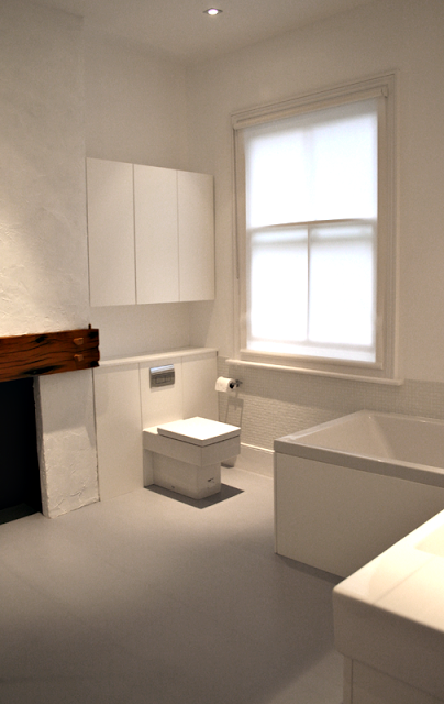
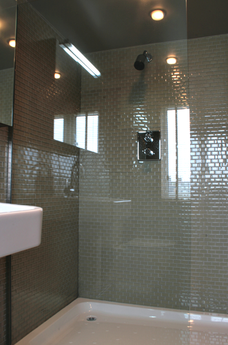
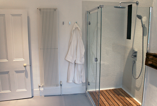
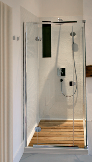
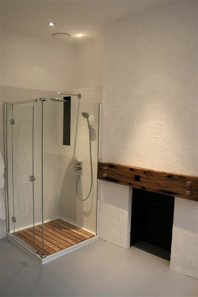
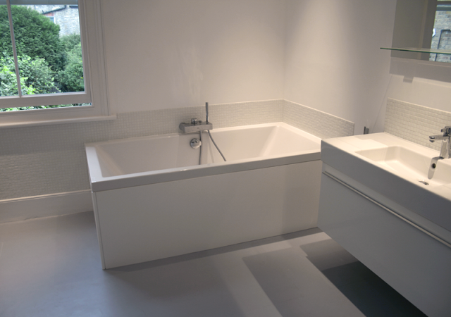
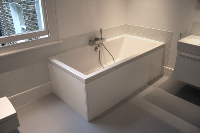
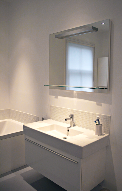
The key features to the room were the stand alone shower unit, the large square bath and the very large basin along with the simple and striking fireplace. We wanted to keep everything incredibly pure, minimal and clean, creating s space that despite the monochrome palette and straight lines is not at all harsh, but calming and meditative.


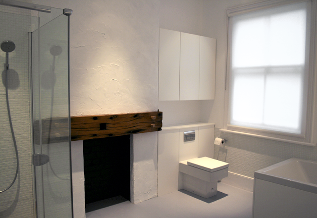
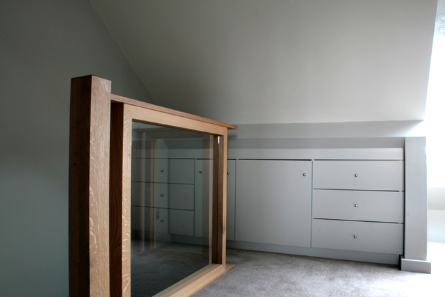
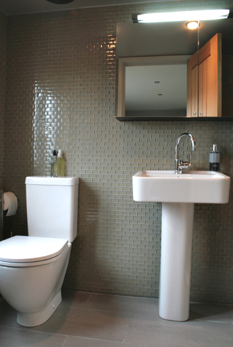
Units above the toilet provide the storage along with the vanity unit. The chimney breast 
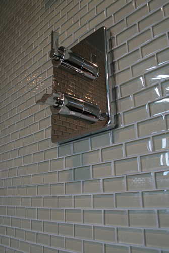
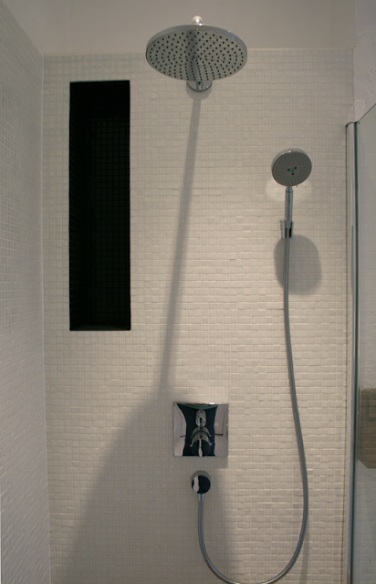
allowed us to inject an element of texture into the room, to sit alongside the nibbled sugar cube effect tiling  in the shower. We re-plastered the chimney with the plaster sucking away at the moment it dried, leaving flat platelets behind. This was then painted and the effect is subtle but effective. Swimming pool glass
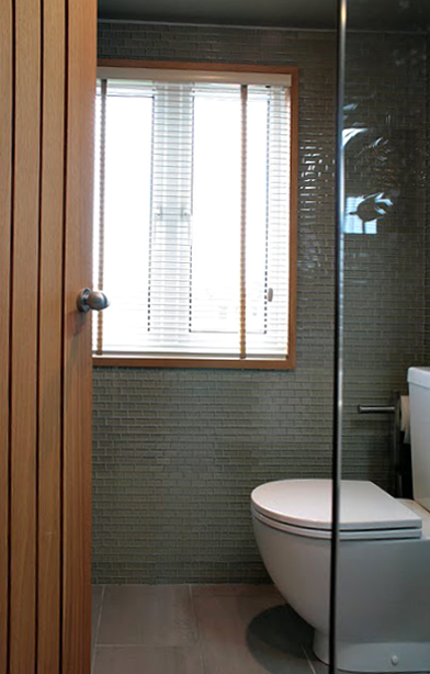
mosaic tiles were used and applied with a slightly textured effect, and a black tiled alcove in the shower cubicle affords a subtle shelf space.


The interior of the fireplace was painted black to swallow up the space and the rubber floor was dressed right into it. The driftwoodwood over the fireplace had been languishing in our back garden for near on 4 years after we had hauled it off a beach in the Lake District. It's oak and when we brought it back to life with the aid of a thicknesser it bacame apparent that this was the space in which to use it. It is some kind of industrial beam, full of stains and character and at some point had been part of someone's campfire, leaving beautiful blackened areas. The oak was washed and sealed with oil.


The flooring is 'dalsouple'; natural rubber in a light grey, and seamless, it creates the impression of expansiveness. Sealed, it provides a low maintenance floor that will look good for years, and warmer and kinder than tiles on such a large space. It also creates a seemless feel to the room that some rooms don't  i.e. always having to provide contrast or juxtaposition. Sometimes it's just essential to create and pin  down a design that doesn't challenge and make itself known in the usual ways. 


All in all, the project was an exercise in subltety.

basement living - victorian house

project: living area, kitchen, extension


features: reclaimed antique parquet muhuhu flooring, Silestone worktop, induction hob, wine storage


the kitchen with view to dining room extension (phase 6)


This basement conversion and extension was a huge project, and a fantastic space. A lot of work was carried out to turn what was a dark, and slightly dank basement area into a family space that is extremely habitable and stylish, and given its situation, filled with light. We tackled the project in stages, firstly creating a cosy living and play area in the bay window space at the front along with a central kitchen, and then a pause before the major building project of a light and airy new extension as a dining area, which leads out onto a same level outdoor living space. 


When we began, red 'quarry style' tiles sat on the floor, a dark blue 'county style' kitchen blocked off the far end of the room which has now been opened up to the new extension, replacing a rather leaky conservatory type space. The chimney at the living end had also been blocked up previously and the damp that was inside the chimney was interfering with the skirting. All of this was opened up and the rubble removed. We reclaimed the space in the chimney as a display point with a huge oak lintel, and vented it to keep the chimney aerated. The floor was a different story; all the tiles were removed and fortunately, we did get back to a layer of concrete on top of which was laid a breathable membrane. The floor was then put down on a substrate. After much time fitting and sanding the reclaimed parquet the effect was complete - it appeared as if it had been down for the past 120 years or so. A lot of work and time went into the floor but the results are remarkable.


parquet flooring in herringbone configuration


Choosing something that has been used before, despite the clean up process, still means that you are quite likely to get an amount of character running through the floor which can be lacking in pristine wooden floors. we also loved the 'eco' quality of a reclaimed floor, and its history was in keeping with the character of the house. The parquet block floor started life as we knew it in individual blanks bundled into yard squares, and stored in a warehouse in Bath (Walcott reclamation) who deal with architectural antiques. In its previous incarnation it was a school gym floor. It is a wonderful material - dense and fragrant and full of character. Every individual block was processed to be the right depth, this involved stripping off the tar from the bottom using an electric planer. The resulting floor shows incredible personality.


We specified and designed a German made kitchen which was supplied by a local company. We wanted all the surfaces to reflect as much light as possible, and chose a high gloss finish in a beautifully light olive green.  A breakfast bar was added to the scheme which doubled as a useful preparation area and keeps the space sociable.  The wrap around top is Silestone, a quartz based composite stone which has anti-bacterial properties and is incredibly hardwearing and anti corrosion resistant.   Within the L shaped configuration above a miele inset induction hob was set. The owners approached induction cooking after much discussion with some trepidation, but have cherished it ever since. The hob is set into its the top and colour matched intumescent mastik was used to seal it into place. Behind the miele induction hob a hardened glass splashback was fitted, and flat plate sockets (low profile) in stainless steel sit neatly against glass tiles and add further detail.


The wine carrier set into the second chimney stack neatly fills a problem space or 'hole' that the owner wanted us to address. The inventive storage is a modification of a design from another recent project where we reclaimed a disused dumb waiter to house the owners wine collection. The oak frame makes the item stand alone and announce its presence.


Above the undermount sink, the space was kept incredibly simple and uncluttered; a couple of solid oak shelves run the width of the recess. These have inset uplighters in them that cast a light up through the glassware that the owner is collecting. Glass brick shaped tiles behind the stainless steel tap act as the splashback and also help to reflect some light. The franke tap is quite cool too, as it also has a built in water filter.


During the kitchen conversion what was then the back wall was knocked out and steels were put in to accommodate what would become an extension in phase 6. Planning for the extension didn't present too much difficulty, but consideration was applied to where the flooring would end and how it could follow on at exactly the same height. We were also conscious of where the kitchen units would end and how they would interact with the new space. We decided to dress the flooring right up to a false wall that was created for the interim period (on the back of the house) so the extension would be seamless. see Victorian house: extension.


We used the pale olive and lichen colour scheme as a modern twist on the classic 'farrow and ball' kind of lichen, the intension was to keep the space light with colours that follow through from the rest of the house, and are classic and timeless palette. 


Grandpont house> bedroom and on-suite

Grandpont house: loft conversion.
Yr:2007

It is a loft space (bedroom) with an on-suite bathroom with a footprint of 30sqm approximately, incl the bathroom.  There was a very considered and limited palette in this scheme. The muted earth tones were all cleverly balanced. Loft rooms can be difficult in their character; we wanted this one to feel warm and grown-up, a sanctuary.

It's an elegant room, very clean and sharp with a very clear direction.


Two walls were papered, one on the wall as you approach the top of the staircase and the one behind the bed. Both walls run in different directions to each other and so acted particularly well to ease you into the room without being too full on.

The pattern that you see on the walls is by Neisha Crosland and it gives the room a loose light feel whilst playing with all the tones employed elsewhere in the room. An oak framed alcove in the wall above the bed provides extra storage, and a neat interest.

The radiators are by bisque. Its a low level, traditional style with ribbed chambers, in anthracite. These are high performing radiators and very useful at warming a room quickly and holding the temperature. The colour of the radiator can be changed in order to further enhance and stay within the designers range of tone and hue. 


We designed and had made, a very simple, elegant and one-off, oak and glass rail to the top of the staircase.  An oak  frame surrounds 10mm toughened glass. The storage units that are pictured, fitted in the eaves and flanked the escape velux.  


The conversion of a loft space is often at odds with storage needs and this generally tends to be forgotten in the process of creating a useable space. In a lot of our designs there is a real emphasis on clever storage where ever possible. 


Off the bedroom is the on-suite which is a pleasure. Glass tiles wrap around all 4 walls and encase the bathroom in reflected light.
The effect is further enhanced by the mirror and the glass shower screen.  


As per the bannister, the door is of oak and the linear detailing is seen in various other items around the rooms.


The shower base was a 1200mm  x 800mm composite. The glass toughened and bespoke. It is always a good idea when fitting a bathroom in the loft area to over structure the support for the facilities i.e. the floor joists and make sure there are provisions for the potential cleaning of the traps etc. 


Extraction in the bathroom was ducted through the roof space whilst the building conversion was taking place. An icon bathroom fan with PIR and a humidity sensor was used. These are used to great effect in spaces like these where you can control the moisture content of the room. The console is also very elegant and powerful.


Fittings are simple and elegant, minimal but not flashy. All in all, sanctuary, and a little jewel at the top of the house.