Extension with Leicht Kitchen and Nigel Slater Inspired Folding Doors

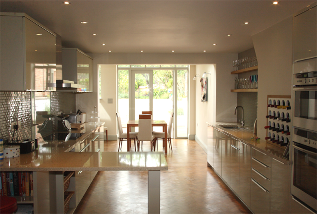
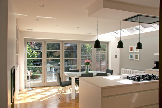
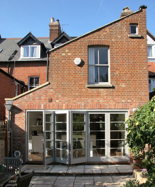
A Victorian townhouse was brought into the 21st century with a new full width, 9 metre extension devised through collaboration with architect Keith Durham, that houses the kitchen and dining spaces. The premise of the project was to increase the ground floor space  giving better functionality to the house and to allow the family to experience a greater sense of freedom within it. Alongside the extension and kitchen shown here, our brief was to apply a smart townhouse aesthetic throughout in a refurbishment of the whole property.


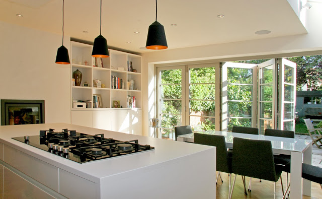
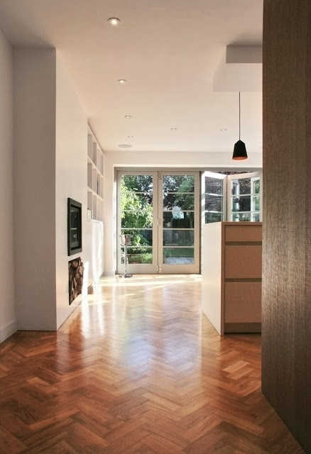
The a wall of folding doors, and exotic and rich teak parquet flooring were integral to the clients wishes as they represented very strong and important aesthetics. Working with the charm of the original Victorian house, we wanted to produce a bright, modern, crisp space, that linked through from the original by using the warmth and detailing of flooring and joinery.


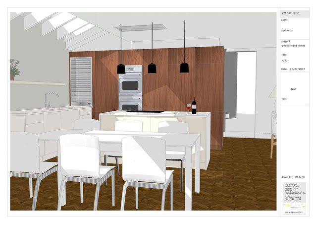
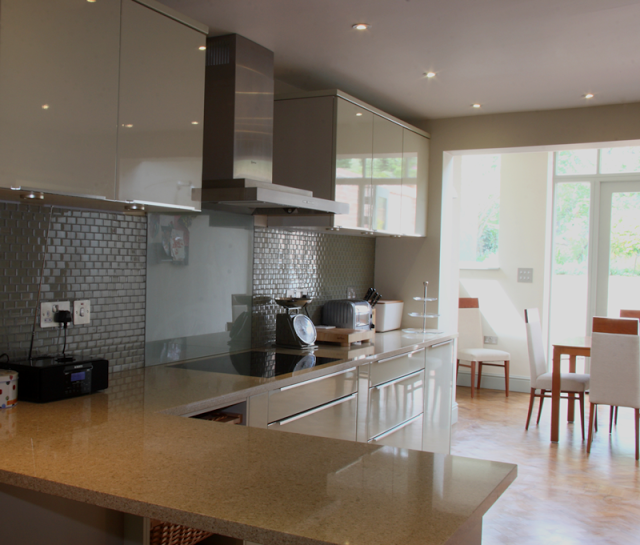
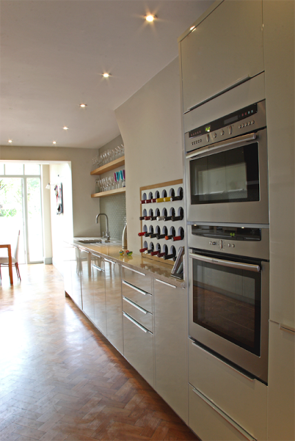
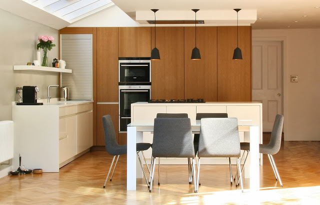
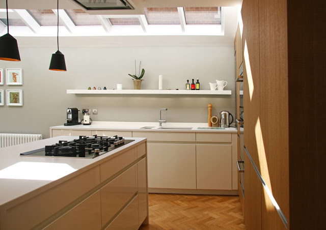
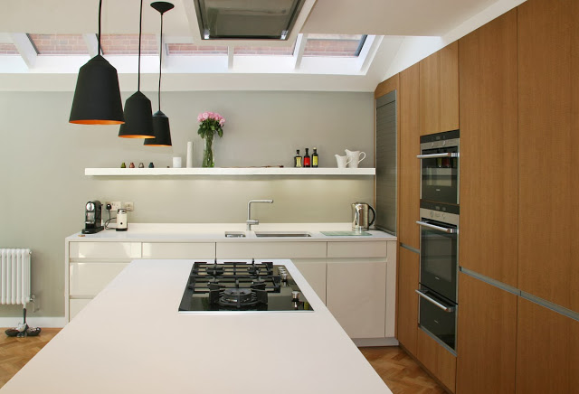
The kitchen design was devised alongside Martin Williamson of InHouse Kitchens, featuring Leicht furniture and Seimens appliances, and the top is a honed matt white composite stone top, which on the island wraps around the two ends. The bank of full height units in a brushed and textured copper oak cleverly conceals the integrated appliances whilst adding texture and substance to the room. The units are double thickness and appear in certain frames as a large mass. Units on the back of the kitchen side add a great deal of extra storage whilst consuming a small but light cloakroom and lavatory snugly separated from the living spaces. Patent double glazing along the one side of the extension floods light through giving that sense of openness that characterises modern living.  Ligne Roset furniture further enhances the dining space. In the far corner of the bank of units a tambour unit conceals a pull out coffee maker and other kitchen aids.
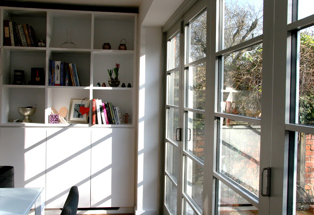
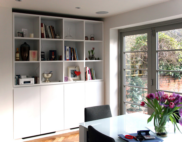


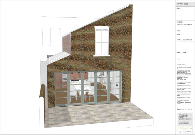
The folding sliding doors are bespoke joinery units made for us by Stuart Barr Joinery, informed by the look of the Nigel Slater bi-folds in Nigel Slater's Simple Cooking.


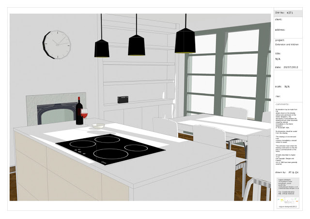
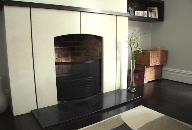
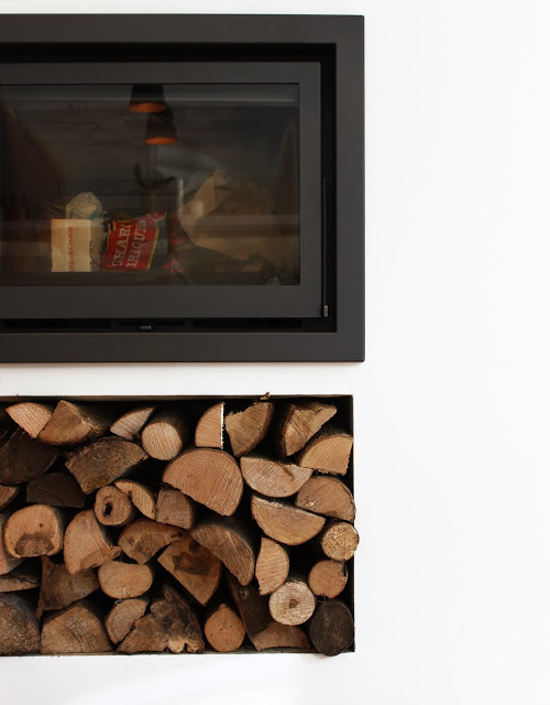
The whole scheme was devised with the addition of a fireplace set into the existing chimney void. Initially it was to be a functioning proving oven but was revised to a multi-fuel stove for increased warmth and celebration throughout. Below shows the integrated scandi fireplace with valuable log storage space below. 


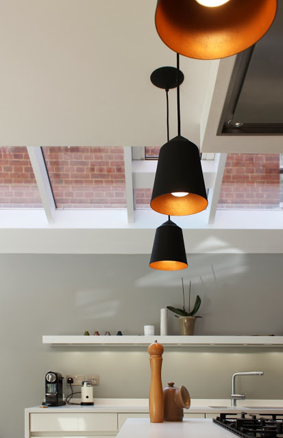
For drama and purpose over the island we used three Circus pendents from Innermost. They are sprayed black on the outside with a copper gold look on the inner. Other lights used are under shelf task lighting  just above the sink area and on upper cheek of the ceiling, three discrete white Hero spot lights to add an extra degree of function.


Below are examples of some of the design material we prepared and used for the process of client communication.


exterior view of side extension and bi-folding doors


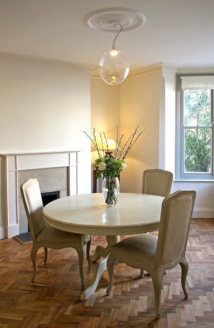
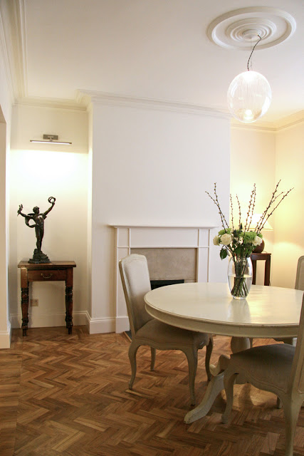
The whole of the ground floor received further treatment, turning what was the old kitchen into a library and media space and upgrading the dining room into a more formal space for entertaining. For continuity the teak herringbone flooring extended throughout the whole of the ground floor complete with a  double edging detail.  The pendent lighting is a fabulous mouth blown crystal glass piece by design studio Atelier Areti named Kirschlag. Two lamps were commissioned and occupy this and the adjoining sitting room / library.  Both have differing lightly feather etched patterns and are exquisite with or without light.


The round ceiling rose, as so often happens in these types of properties, disappears over time and it is often a great event putting them back as they add focus and elegance to a room.


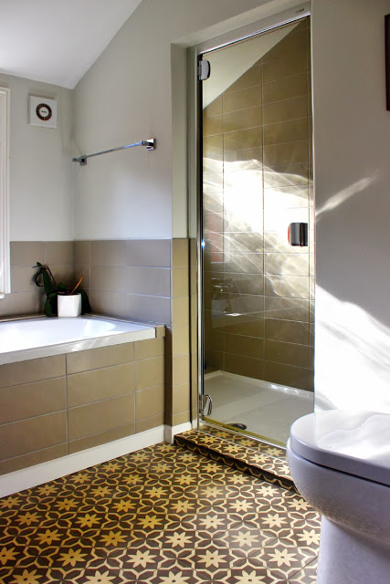
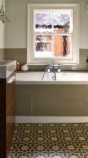
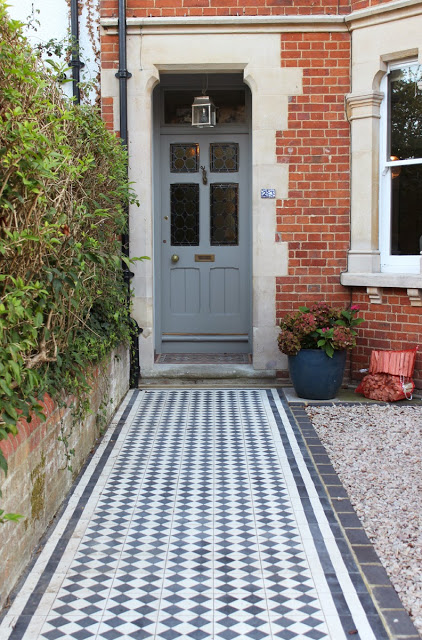
Upstairs we updated bathrooms, including this one shown with encaustic patterned cement tiles from Portugal, which we also adopted for the exterior facelift to the front of the property.


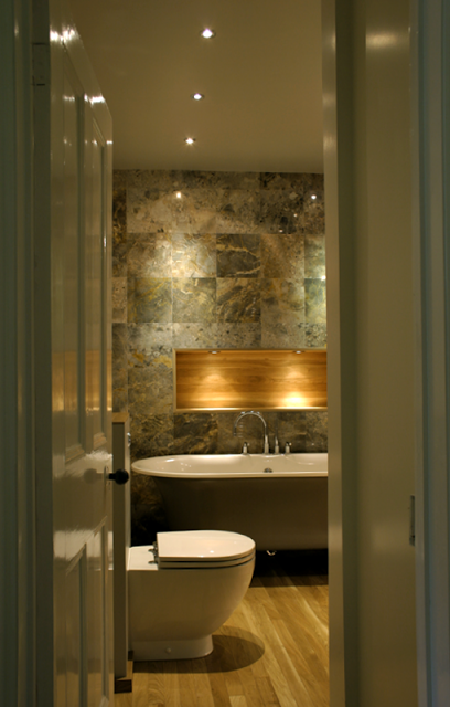
a luxurious bathroom - victorian house


The owners had recently moved into the house and required it to be modernised throughout. 


Many of our customers enjoy the need for the works to be staged, rather than to be carried out all at once. This affords them the ability to assess the scheme and its direction without being bombarded with a great many decisions all at once.  


The starting point of this particular project was to be one of the main bathrooms and culminated in the overhaul of the 25m garden area, completed on the back of a special extension.


1st stage: master bathroom.


palette: > thin strip oak, lemon marble tiles, mirror, flint grey.


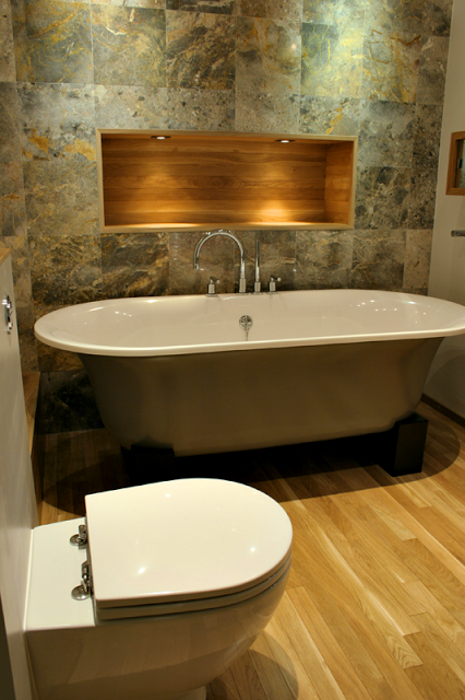
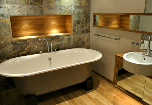
This is a great space for relaxing, that's set in the heart of the top floor, between 2 bedrooms. The room doesn't have a window, however it makes up for the lack of natural light by using light and reflection.  There is a spectacular floor-to-ceiling marble wall with
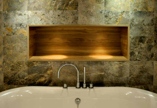
an alcove inset that is lined with the narrow strip oak. This is also lit from above with 2 dedicated dimmable spot lights. The bath is freestanding and is painted on the outside in a light green grey, and the whole thing is sat on two oak cradles. The colours are all complimented by the colours in the natural stone. The lemon marble tiles fitted tightly to each other and the appearance was more monumental rather than 'tiled'. The colour on the walls and the ceiling were painted in a satinwood finish and allowed light to reflect off it for further space and light enhancement.


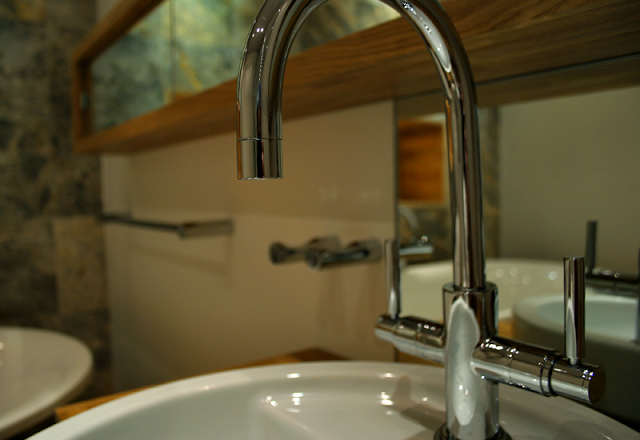
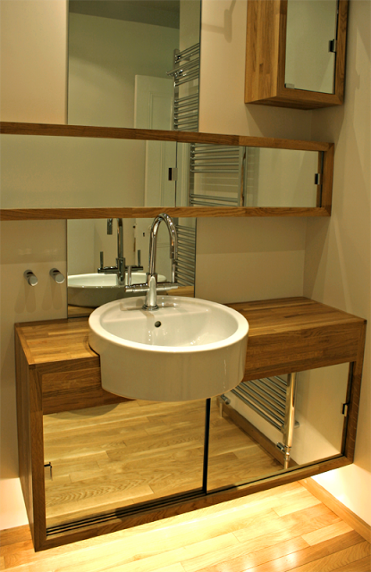
Bespoke oak also features largely in the floating vanity unit which rogue-designs created to fit into the space. The vanity unit itself has 2 sliding mirrors that give the illusion of more space. It was imperative to create the feeling that the space was light and that it was expansive in nature.  Behind the sink; a mirror and above this, another one-off unit that was over 1.5m in length and had 3 long sliding glass panels. Above this unit another glass panel that hit the ceiling. The illusion was cemented further by being able to see the ceiling spots in the mirrors.


a grown up living room - victorian house

Victorian House living room  

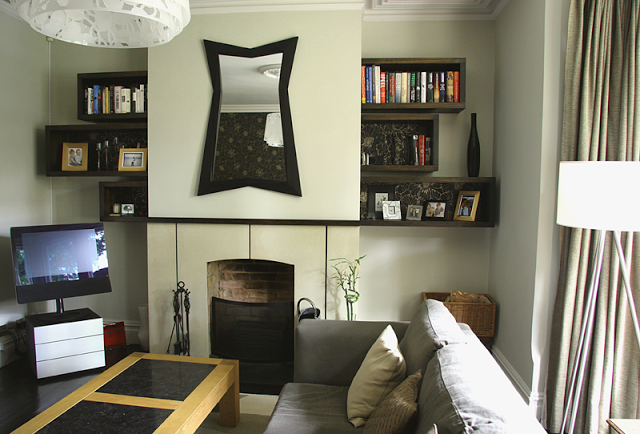
features: cast concrete fire surround with wood detailing, stained piranha pine box shelving, dark stained flooring, double sliding curtain rail, danish rosewood sideboard, architectural light shade, handmade radiator covers.

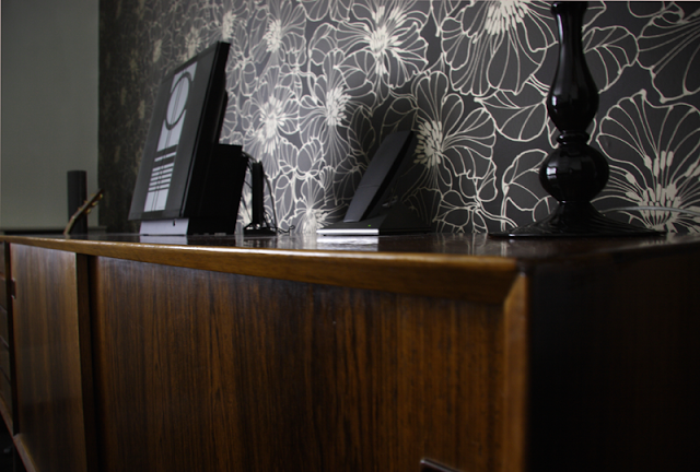
We chose to use an organic and muted colour range complimented by the use of dark stained material (including the floor), textures and subtle tonal changes to create an intimate room with a quiet aspect. We promptly got to work on a fireplace design, and hand cast a simple white polished concrete piece with stained wood mantle.  A large L shaped grey corner sofa provides flexible seating. The vintage Danish rosewood sideboard from our lovely friends at The Modern Warehouse sits on the back wall against striking wallpaper.

Opposite, on either side of the chimney breast, there is a configuration of dark stained display boxes of differing sizes. They are like a sliding rule - each pair amounts to the same space, separated by the chimney breast. We used the wallpaper at the backs to set off the objects within, and create continuity with the feature wall. The large oak table with two slate insets is the owners own.

Above the fireplace is a very striking mirror which the owner purchased from a gallery in the Czeck republic. Its strong features also informed the design and it adds a great focal point to the room.

The cut perspex pendant lamp is designed by Louise Campbell for Louis Poulsen, titled 'collage', has 3 concentric white perspex rings which have been laser cut with a floral motif. When the light is on, it creates a wonderful flecked floral pattern around the room, especially when the light is subdued. As there are many strong design elements in the room, the light shade doesn't actually dominate, it rather delicately absorbs with colours.  In fact it tends to sit in the background until lit when it takes on its splendour.

The ceiling rose that you see, is a beautifully crafted plaster reproduction of a heritage piece that was installed as part of the design.We felt the ceiling looked rather sparse without it. While it wasn't evident that a ceiling rose had been there previously, the room has fine original cornice molding, so it sits perfectly well, and creates focus and mixes the old and new with the contemporary chandelier.

Two pairs of curtains, one sheer linen for privacy, the other a thick raw weave cotton for warmth, are full length and hang on a double bay window pole  in brushed steel (a piece of clever engineering) It is finished off with hand blown glass finials. Small touches against large bold pieces help to create little surprises that enhance the experience.

Below are a few detail shots from the room.

basement living - victorian house

project: living area, kitchen, extension


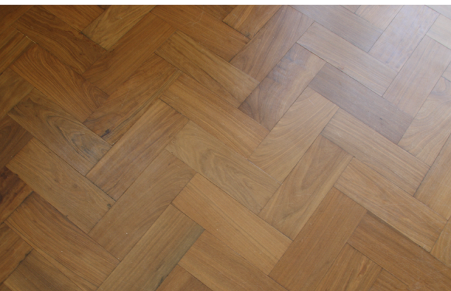
features: reclaimed antique parquet muhuhu flooring, Silestone worktop, induction hob, wine storage


the kitchen with view to dining room extension (phase 6)


This basement conversion and extension was a huge project, and a fantastic space. A lot of work was carried out to turn what was a dark, and slightly dank basement area into a family space that is extremely habitable and stylish, and given its situation, filled with light. We tackled the project in stages, firstly creating a cosy living and play area in the bay window space at the front along with a central kitchen, and then a pause before the major building project of a light and airy new extension as a dining area, which leads out onto a same level outdoor living space. 


When we began, red 'quarry style' tiles sat on the floor, a dark blue 'county style' kitchen blocked off the far end of the room which has now been opened up to the new extension, replacing a rather leaky conservatory type space. The chimney at the living end had also been blocked up previously and the damp that was inside the chimney was interfering with the skirting. All of this was opened up and the rubble removed. We reclaimed the space in the chimney as a display point with a huge oak lintel, and vented it to keep the chimney aerated. The floor was a different story; all the tiles were removed and fortunately, we did get back to a layer of concrete on top of which was laid a breathable membrane. The floor was then put down on a substrate. After much time fitting and sanding the reclaimed parquet the effect was complete - it appeared as if it had been down for the past 120 years or so. A lot of work and time went into the floor but the results are remarkable.


parquet flooring in herringbone configuration


Choosing something that has been used before, despite the clean up process, still means that you are quite likely to get an amount of character running through the floor which can be lacking in pristine wooden floors. we also loved the 'eco' quality of a reclaimed floor, and its history was in keeping with the character of the house. The parquet block floor started life as we knew it in individual blanks bundled into yard squares, and stored in a warehouse in Bath (Walcott reclamation) who deal with architectural antiques. In its previous incarnation it was a school gym floor. It is a wonderful material - dense and fragrant and full of character. Every individual block was processed to be the right depth, this involved stripping off the tar from the bottom using an electric planer. The resulting floor shows incredible personality.
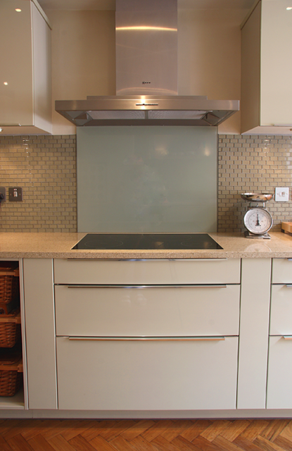


We specified and designed a German made kitchen which was supplied by a local company. We wanted all the surfaces to reflect as much light as possible, and chose a high gloss finish in a beautifully light olive green.  A breakfast bar was added to the scheme which doubled as a useful preparation area and keeps the space sociable.  The wrap around top is Silestone, a quartz based composite stone which has anti-bacterial properties and is incredibly hardwearing and anti corrosion resistant.   Within the L shaped configuration above a miele inset induction hob was set. The owners approached induction cooking after much discussion with some trepidation, but have cherished it ever since. The hob is set into its the top and colour matched intumescent mastik was used to seal it into place. Behind the miele induction hob a hardened glass splashback was fitted, and flat plate sockets (low profile) in stainless steel sit neatly against glass tiles and add further detail.
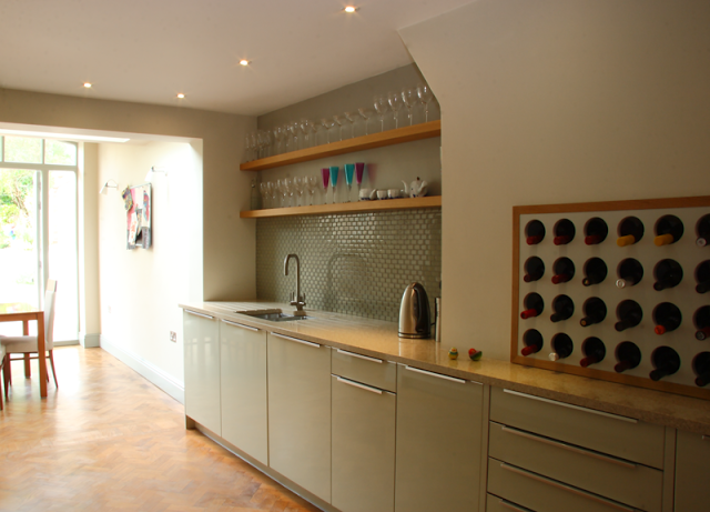


The wine carrier set into the second chimney stack neatly fills a problem space or 'hole' that the owner wanted us to address. The inventive storage is a modification of a design from another recent project where we reclaimed a disused dumb waiter to house the owners wine collection. The oak frame makes the item stand alone and announce its presence.


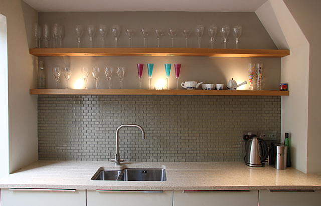
Above the undermount sink, the space was kept incredibly simple and uncluttered; a couple of solid oak shelves run the width of the recess. These have inset uplighters in them that cast a light up through the glassware that the owner is collecting. Glass brick shaped tiles behind the stainless steel tap act as the splashback and also help to reflect some light. The franke tap is quite cool too, as it also has a built in water filter.


During the kitchen conversion what was then the back wall was knocked out and steels were put in to accommodate what would become an extension in phase 6. Planning for the extension didn't present too much difficulty, but consideration was applied to where the flooring would end and how it could follow on at exactly the same height. We were also conscious of where the kitchen units would end and how they would interact with the new space. We decided to dress the flooring right up to a false wall that was created for the interim period (on the back of the house) so the extension would be seamless. see Victorian house: extension.


We used the pale olive and lichen colour scheme as a modern twist on the classic 'farrow and ball' kind of lichen, the intension was to keep the space light with colours that follow through from the rest of the house, and are classic and timeless palette. 


victorian house: bathroom 2


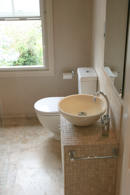
1st floor bathroom > shower room, ground floor cloakroom/boiler room.


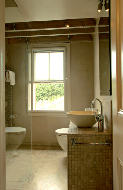
The second of the bathrooms co-incided with the formation and refurbishment of the boiler room, which was also turned into a ground floor toilet with airing cupboards. The second of the main bathrooms is a shower room that presented its own problems.  Far from being spacious, this room crams a lot of 'look' for such a small space. 2m sq approx. 


Its position on the 1st floor was directly over the boiler room and therefore made a great deal of sense to convert both rooms at the same time. 


All the walls were stripped back to brick. This was not a job for dust-haters. As the house had 140 years on it, the walls were of tired plaster that had blown in places and the ceilings were lath and plaster. This gave us a complete blank canvas for the creation of the space. Floors were adjusted in the shower room to accomodate the wetroom floor. Part of the ceiling was restored with plasterboard and the other part, left open. The roof trusses were exposed and sanded. The space had become subtley more architectural with this hidden roof space. It did mean we could hide the extractor in this space were it would be less conspicuous.


As mentioned, this was a wetroom and as such had to be prepared thoroughly and very well too prevent any future leakage. This was our first wetroom and as such, we took all the necessary precautions when installing the product. We settled on a base from 'on the level' who specialise in wetroom products along side their acrylic wall solution. Care was taken to make sure all the gaskets, around the products on the wall and in the floor, were perfectly sealed and tight.


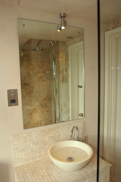
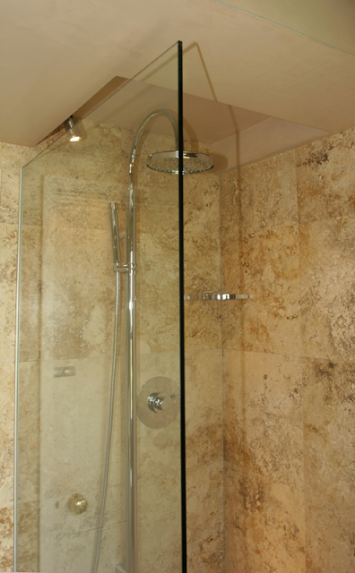
The shower area is decked out with travertine marble. Mosaic travertine tiles across the floor going into the larger square panels on the walls. As there are no gaps between the wall tiles, the impression is of one piece of marble. 


The brushed stainless steel shower pole is by Bristan and stands like a piece of sculpture, projecting from the wall in the wet area. The 'drencher', or flood head is more appropriate in these settings as they tend not to create excessive water spread, unlike power shower heads.


The walls that weren't tiled were treated with many layers of pigmented varnish. Very thin at first and becoming stronger at the end.  This did 2 things: added greater protection against water damage and secondly gave a sensory quality, akin to lustre ware or silk.  What the colour of the plaster gave to the room was its warmth. It made the pigmented varnish a slight tone warmer in appearance. 


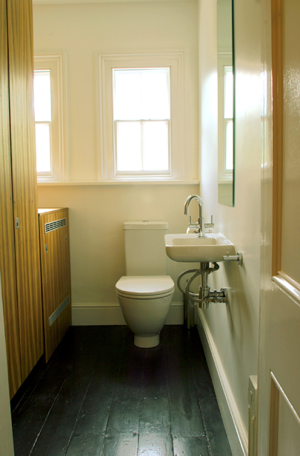
ground floor cloakroom.


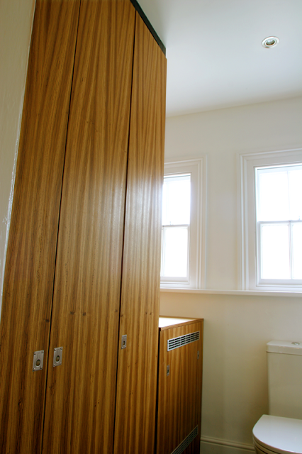
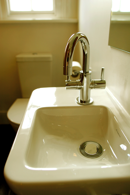
key events would be the units that house the boiler. A lift off panel hides the unit itself whilst the larger cupboard doors conceal the drying space and the stuart turner pumps that create greater pressure for the shower, directly upstairs. The doors are panels which have been made to size and veneered with zebrano. These are set off by the flooring which was left as floorboards, but painted black. 


I think the room speaks for itself. Its tidy and crisp and has a very calm and clean and delicate appearance. 


ground floor toilet and boiler room
zebrano doors with inset handles
handwash sink